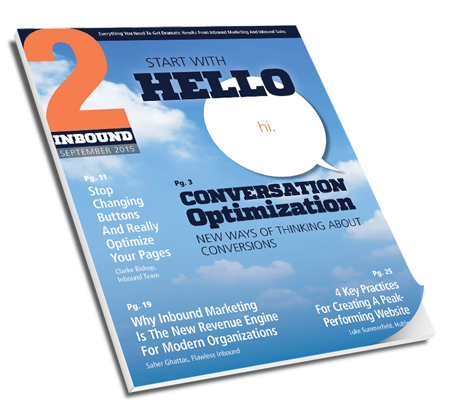
I'm very pleased to have an article in the September 2015 issue of 2Inbound magazine. The issue is all about how to improve your conversion rates, and my article specifically covers all the areas you should consider.
For now, subscriptions are free, so get your copy right away. My article starts on page 12, but the magazine is full of good ideas.
As a summary, below are the seven areas to consider as you start optimizing your pages for better conversion rates.
Read the full 2Inbound article for more details and for Quick Tips on how to improve each area.
1 - Traffic
Who is visiting your page and where are they coming from? If you have the wrong kind of visitors coming to your page, they are not going to take the desired action.
2 - Alignment
Alignment means going through the entire flow from search result or ad to landing page to offer to premium content to thank you page. Ensure that you always deliver on your promise and that you have a consistent message throughout the flow.
3 - Offer Value
The value of an offer is determined by the buyer and by what they want. You may have spent a lot of time and money creating a beautiful PDF. But, if the buyer thinks it’s off topic or is a bunch of self-promotion, it has no value. Not to them.
4 - Clarity
Is your landing page as clear as possible? Can visitors tell exactly what to do?
Most of us don’t pay close attention when reading websites. We are skimming and just want to get what we want as fast as possible. So, make it easy for visitors. Don’t force people to think.
5 - Anxiety
What might worry your landing page visitors? How can you keep them safe and help them relax?
6 - Distraction & Urgency
What could distract your visitors and stop them from moving forward?
Images can help tell your story. Just watch out for photos that are more interesting than your offer or your copy.
7 - Friction
What might be hard to use or confusing? Friction occurs when the page or form is hard to use.
Long forms look hard to use even if the requested information is simple. Only ask for the information you absolutely must have right now. First name and Email for example.
There's a lot more, so read the full article, make your pages convert, and get more leads!
More Leads ♦ More Sales ♦ More Visibility ♦ More Fun ♦ Marketing & Sales Results
Inbound Team is Georgia's Digital Marketing Agency specializing in helping businesses grow through inbound and digital marketing.
Inbound Marketing Services are available for companies that want more leads and want to accelerate their growth.

